

")
Type Cases
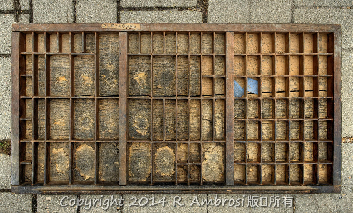
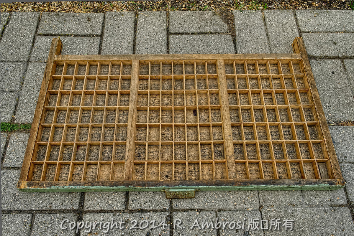
[/wm_text_block][/vc_column][/vc_row][vc_row][vc_column width=”1/2″][wm_text_block]There were many, many different kinds and styles of type drawers and type cases. All of the type cases that we ever acquired were used and purchased from other printers.The most common kind that we had were full size and had what was called the California layout, that is the design and size of the compartments in the case and the designations of where the letters went. This was simply called a California Case.
Then as an offshoot of this, this same full size of case was available in lower case only.
Then we went on from there to double cap cases, triple cap cases and lastly a quad cap case. These cap only cases were designed for fonts of type that were made in caps only. And in the triple and quad cases, these were for the very special lining plate gothics that were made in mostly four sizes but some in three sizes. All of these triple or quad fonts could and very often were used in the same line to print as large and small caps. Hard to explain, but that is the way it was. I also seem to remember a full size case in caps only for the whole case. But I am not sure.

Double Cap California Case

Double Cap California Case- closeup of compartments

Double Cap California Case

Double Cap California Case
Then came a very wide variety of case layouts. Just about every type foundry in the world came up with it’s own type case and very often this was to facilitate the language in that country. For example, French. You need extra compartments to hold the various French accented letters. Same with German.
There was also a very wide variety of qualities of type case. The very best quality was from England. Their wood joinery was just perfect and in fact was widely acknowledged as the best that there was.
In my time, I did see some home made type cases and the workmanship was mostly just horrible. I threw all that I came across out in the garbage.
All of the type case designers tried to vary the size of the compartments in their cases to accommodate the amount of letters contained in their alphabet for ordinary reading. Mostly letter counts were done in book work and percentage tables were worked out to determine how much space was required for each letter.
A quick obvious example in English readily shows that very many vowels are needed compared to other letters. I am very unsure about non English languages. Do they even have vowels? I think the so called Latin languages all have vowels.
And again once one goes over to the Crylic languages, a completely different type case layout is required. I really do not know anything about the Arabic language type cases.
The origin of the terminology of Caps and lower case, comes directly from the type cases as used by the first original printers. The cases were smaller and just about square. This size was commonly called a three quarter case. My memory suggests that they were about 20 inches square and the lower case or small letters were lower down more close to the type setter, and the caps were higher up as they were used less often in book work typesetting.
Incidentally type setters were called comps or compositors.
The first printers around the prairies commonly used a type case that was very open and held in a news rack. This was fine and worked well, but the cases were open to the dust and dirt and general traffic around the composing room and the type compartments got dirty very quickly. It then became hard to set type and get a good and easy lockup.
So cleaning was needed. This as done in two ways. A case was taken outside of the shop and blown clean using a leather bellows. The other method used was to screen the type case by placing a heavy duty and custom made screen on top of the type case and then turn the case upside down and give the case a good shake. The dirt was supposed to fall out through the holes in the screen. This second method did work, but all too often some of the letters were damaged.
The main way to solve the dust problem was to buy dust proof cases that fitted much more tightly into the type case. This did work way better than a news rack, but it was not perfect. In time the cases still had to be blown out. Another big advantage to the rustproof case was that more type cases fitted in a the cabinet of the same size.
Incidentally, I personally blew out hundreds of type cases.
We obtained many of our type cases from Commercial Printers and the Milestone Mail and several other Saskatchewan printers over the years. Many, if not most of these cases had very little type in them by the time we acquired them and what type there was, was mostly worn out. We just dumped the type and sold for scrap, and then saved the empty case.
I have a range of type cases available.[/wm_text_block][/vc_column][vc_column width=”1/2″]
Pictoral Tour of Type Cases and Layout
[wm_image src=”1468″ margin=”8px 0 8px 0″][wm_image src=”2258″ margin=”8px 0 8px 0″][wm_image src=”2268″ margin=”8px 0 8px 0″][wm_image src=”2248″ margin=”8px 0 8px 0″][wm_text_block]
Type case
[/wm_text_block][wm_image src=”2277″ margin=”8px 0 8px 0″][wm_text_block]Closeup of California case and its label.
[/wm_text_block][wm_image src=”2273″ margin=”8px 0 8px 0″][wm_text_block]Closeup of compartments in a California case.
[/wm_text_block][wm_image src=”2276″ margin=”8px 0 8px 0″][wm_text_block]Closeup of caps compartments. Notice the extraordinary joinery that reflects the remarkable workmanship that went into making these cases.
[/wm_text_block][wm_image src=”1217″][/vc_column][/vc_row][vc_row][vc_column][wm_image src=”2159″][/vc_column][/vc_row]
You must be logged in to post a comment.